Settings & Measurements

⚙ Settings

Settings menu

All thirteen items of the gear menu, in the order the app puts them in.

The menu

The gear sits top right in the bar. It drops open into a list in four parts: Profile at the top, then the five screens where you set something, then five pointers to explanations, and at the bottom in red Clear logbook. Thirteen items, and below they come by in that order. On the iPhone it is the same list.

Gear · thirteen items

Profile

The longest screen in the app, in six blocks. My Body is name, sex, age, height and weight. Strategy & goal is losing, maintaining or gaining, with the pace, your focus, longevity mode and your target weight. Protein target calculation lets you pick whether we base your fat-free mass on BMI or on your body fat percentage, optionally with a body fat target as well. Activity & burn covers how active today is and whether your smartwatch replaces your fixed targets. Daily targets shows the calculated advice and lets you override the calorie and protein target, switch on water tracking and fill a free field with extra info for the coach. Week & diet is only for the meal planner: weekly profile, eating window, diet type, restrictions, allergies and grocery country. At the top sits Profile history, which is why an older day is calculated with the targets that applied back then.

My Body holds the five details the rest of the screen depends on. Your name is only used to address you and may be up to forty characters. Sex, age, weight and height go into the Mifflin and St Jeor formula, which estimates how many calories you burn on a day when you do nothing at all. The app accepts an age from 10 to 120, a weight from 30 to 300 kg and a height from 100 to 250 cm. Leave the height empty and both BMI and FFMI stay blank, because they each need it.

Strategy & goal turns that burn into a daily target. Under Lose you pick a pace from 0.25 to 1.0 kg per week, and since the app works with 7700 kcal per kilo of fat that means 275 kcal per day off at the slowest pace and 1100 at the fastest. Under Gain it is not kilos per week but a fixed surplus per mode: 150 kcal for a lean bulk, 250 for a clean bulk and 500 for strength and mass. Under Maintenance your target simply equals your burn. The focus you choose below that leaves the calories alone but changes your protein target. Longevity makes the coach look at fibre, plant diversity and processed foods as well, and that switch is locked as long as your coach style is set to Vitality, because Vitality turns it on itself. On maintenance a target weight may sit at most three kilos from your current weight, otherwise the app refuses to save.

Protein target calculation is the choice that causes the most confusion. Your protein target is calculated from your fat free mass, and there are two ways to estimate that. On the BMI route the app derives your body fat from a table based on your BMI class and your sex, and a body fat percentage you entered yourself is ignored. Only on the body fat route does your own measurement count, which means a new measurement shifts your daily targets. The factor on top depends on your focus: 1.9 grams of protein per kilo of fat free mass for balance, 2.2 for balanced, clean bulk and sport, and 2.7 for getting leaner, lean bulk and strength. On the body fat route you can add a body fat goal and a ceiling as well.

Activity & burn decides how much you burn on top of your resting rate. Sedentary multiplies by 1.2, moderate by 1.55 and active by 1.725. Turn on Use Smartwatch Data and your watch's measured burn replaces that estimate as soon as it arrives, while the brand you pick decides how steps from your phone and your watch are merged. Leave the switch off and the app keeps using the activity factor, even when watch data is genuinely coming in through Health linking.

Daily targets first shows what falls out of everything above, then lets you override it. Enter a calorie or protein target yourself and the app holds on to it, so it no longer moves with your weight or your activity; clear the field again and it returns to automatic. Track hydration adds the water ring to your logbook. The free text field Extra info for the AI coach has no character limit and travels along as personal context in your daily prompt and in meal analysis, but deliberately not in the week planner. This is where you note an injury, an intolerance or shift work.

Profile · from My Body through to Extra info for the AI coach

Notifications

Seven cards, and only the top two really send a push notification. Reminder when not logging arrives after a few days without a logbook entry and only during daytime; Good morning motivation arrives between 08:00 and 10:00. You get at most one a day, and inactivity takes priority. The other five stay inside the app and only put something on your screen: a poster at every 5 kg towards your target weight, a share poster when you reach your target weight, the same one for your body fat target, a monthly poster as long as you stay inside the maintenance band of 3 kg plus a tip as soon as you drift outside it, and a banner on the week overview when you hit your plant week. Under the three poster cards sits an anti-spam switch that keeps the same milestone to a single appearance; switch it off and it may return when you cross the line again.

The exact rules appear nowhere in the app itself. The reminder when you stop logging only fires after two full calendar days without an entry, appears only between 08:00 and 21:00, and then stays quiet for at least two days. The morning motivation lands at a random moment between 08:00 and 10:00. If both come due on the same day the reminder wins and the motivation is skipped. The five in-app cards have no time window: they appear the moment you open the app and meet the condition. Deny the system permission to notify you and the top two go silent while the other five keep working.

Notifications · seven cards

Preferences

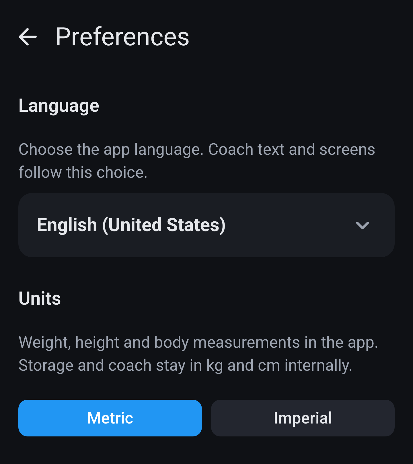
Three choices on one screen. Language unfolds into fourteen languages, each in its own spelling, and the app switches over straight away. Measurement units is Metric or Imperial: Imperial puts weight in lb, height and body measurements in inches and distances in miles. Water display only appears on Imperial and lets you choose between fl oz and ml. Internally everything stays kg, cm and ml, including in what the coach gets to see, so switching does not change your history, only how it is shown.

Imperial touches more than you would think. Your weight and weight goals move to pounds, your height and all your body measurements to inches, your running and cycling distances to miles and your pace to miles per hour. Calories, protein and the other macros stay as they are, because there is no imperial version of them. What you entered earlier is converted rather than remeasured, so 80.0 kg then shows up as 176.4 lb. And because storage stays metric, your coach always sees kilos and centimetres no matter how you set the screen.

Preferences · language and units

My AI coach

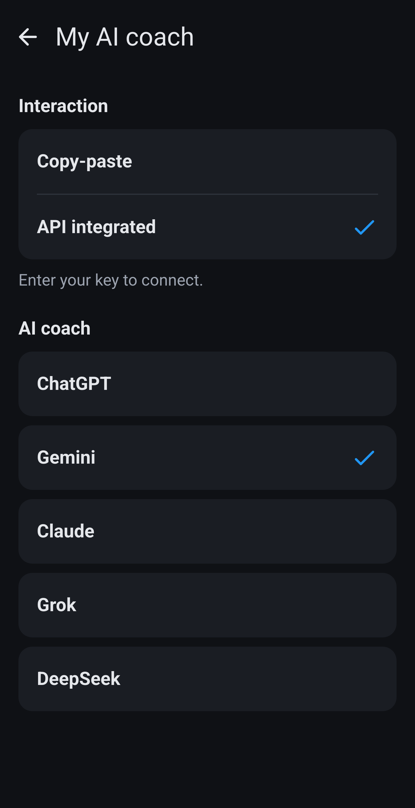
At the top you choose how you talk to the coach: copy and paste, or API inside the app. Below that your coach: ChatGPT, Gemini, Claude, Grok, DeepSeek, your own https link or clipboard only. API adds the key field with Test connection, plus whether meals are saved straight away and whether a report asks for confirmation first. Copy and paste instead shows Open via (app or browser), the paste helper and the default export date. Meal analysis applies to both modes, see below.

The choice at the top changes the rest of the screen. With Copy-paste the app builds a block of text that you paste into your coach's chat yourself, and you paste the answer back; nothing leaves the app directly. With API integrated the app talks to the provider itself and you stay in the chat screen. Under AI coach you pick ChatGPT, Gemini, Claude, Grok or DeepSeek, or you enter your own https address if you use a different service or your own server. Pick clipboard only and API mode is not available.

If you use the API you enter your own key here. It is stored encrypted on your device, is not included in a backup, and leaves your phone only towards the provider you chose. The screen itself is marked secure, so other apps cannot take a screenshot of it and it stays blank in your list of open apps. Test connection sends one small request and tells you straight away whether the key works, so you do not find out in the middle of a meal analysis. Below that you choose whether an analysed meal lands in your logbook straight away or is shown for confirmation first, and whether a report asks for confirmation before it is saved.

Copy and paste mode brings up different options. Open via decides whether the app opens your coach in its own app or in the browser. Show paste helper turns on a small panel that surfaces at four moments in the daily flow and walks you through copying and pasting back step by step. Before you share anything for the first time the app asks permission per provider, so you know where your data is going. At the bottom sit the start date and the default export date: the first decides how far back the coach may read your history, the second which day an export picks by default.

Meal analysis

Settings → My AI coach → Meal analysis section. Applies to clipboard and API: the prompt reads your profile.

Extra questions for unclear meals (master): on = the coach may ask briefly when an ingredient or portion is unclear. Off = never ask: estimate immediately with fixed assumptions.

Sub toggles (only visible when master is on): grains, dairy, meat and fish, portion and preparation, drinks and pastries.

What happens when a switch is off matters just as much, because then the coach asks nothing and makes a fixed assumption instead. With grains off it assumes white bread and white pasta, and awards no plant point for wholegrain. With dairy off it becomes semi skimmed. With meat and fish off it assumes the cut with the visible fat still on. With portion and preparation off it counts five grams of oil per portion and fifteen grams of spread per slice. With drinks and pastries off it picks the upper end of what is plausible. So you always get a number, just a cautious one.

Ask for a photo when estimating is needed has its own switch, but only works when the matching category is on: for drinks, pastry, meat/fish, ice cream or salad, not for bread type or spread.

Meal analysis · master switch, the five topics and the photo request

Coach style

Four voices: Default encouraging with the numbers included, Motivator high energy with plenty of emoji, Athlete thinking in cut and bulk, and Vitality looking through a longevity lens, which also switches longevity mode on. The choice drives both the chat and the wording in your reports. On this site we show Motivator as the example.

The difference is not only in the tone. Standard adds nothing to the coach's instructions and is therefore the neutral starting point. Motivator changes only how things are written, not what is sent along. Athlete and Vitality go further: they add an extra block of data to your daily prompt and an extra line under your daily total, covering training and protein timing for Athlete and fibre, plant diversity and processed foods for Vitality. Choose Vitality and the app switches longevity mode on in your profile and keeps it there for as long as this style stays active.

Coach style · Motivator

Database & maintenance

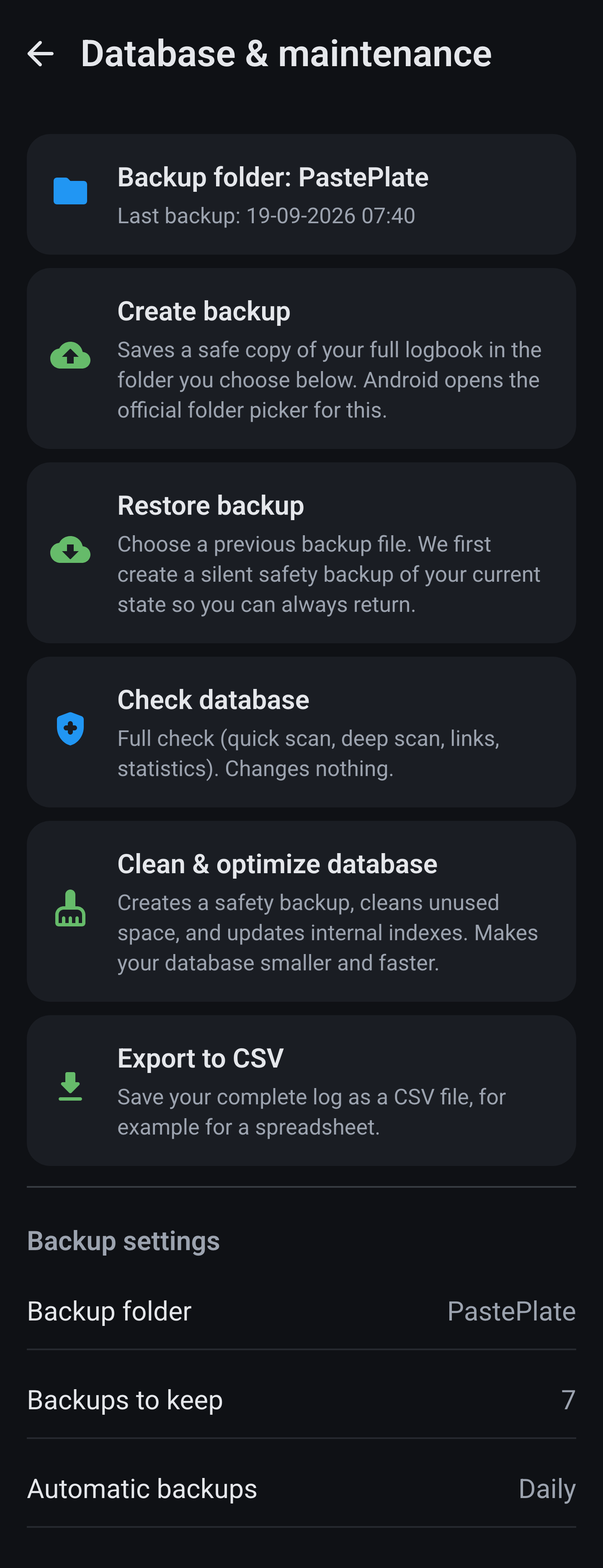
Create backup writes your whole database to a single file, Restore backup reads it back and restarts the app. Check database is a diagnosis and repairs nothing; Clean & optimize database makes a safety copy first and then shrinks the file. Export to CSV only gives you your logbook rows. You can pick a folder, how many copies to keep and whether the app backs up daily or weekly by itself. The same file travels both ways between Android and iOS. Your API key is never in it. See also privacy.

A few things are worth knowing before you press a button. Restore backup replaces everything currently in the app and restarts it, so it does not merge anything. Check database only looks and changes nothing, not even when it finds something. Clean & optimize database makes a safety copy of its own first and then shrinks the file, which reclaims space after you have deleted a lot of entries. If you turn on automatic backups, the number of copies you keep decides when the oldest one disappears by itself. The CSV export is meant to be opened in a spreadsheet and is emphatically not a backup: you cannot restore it.

Database & maintenance

Privacy policy

Opens the privacy statement in your browser. The short version: your logbook stays on your own device, and only what you send to an AI coach yourself leaves the app.

Setup

Opens the setup page in your browser, with the steps to get the app ready and pick a coach.

Health disclaimer

Opens the health disclaimer in your browser. PastePlate-AI calculates and shows, but gives no medical advice.

Health sources

The only one of these five that is a screen inside the app. Eight cards explain where the numbers come from: BMI, FFMI, total fat, saturated and trans fat, unsaturated fat, fibre, plant variety and the AI coach itself. Under each card sit the sources we lean on, from the WHO and EFSA to the research behind FFMI; tapping opens them in your browser. At the bottom there is a shortcut to the health disclaimer. The same sources are on Health sources.

Health sources · eight cards
⌚ Health

Health sync

Settings → Health sync. This is the only place where data from outside the app comes in.

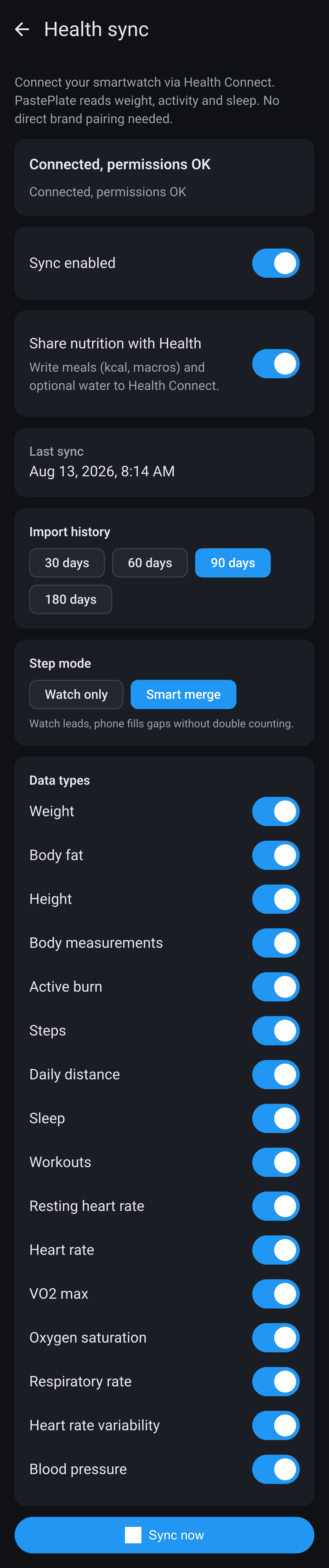
Your watch does not talk to PastePlate-AI directly. On Android everything goes through Health Connect, on the iPhone through Apple Health: your watch writes into it and we read it out from there. That is why the screen starts with the status. If Health Connect is not there, the button sends you to the install; if permission is missing, the system permission sheet opens. Once it says you are connected and the permissions are fine, you can flip Sync on. Grant only part of the rights and syncing simply carries on: what you allowed comes in, the rest stays empty.

Below that sit sixteen kinds of data, each with its own switch: weight, body fat percentage, height, body measurements, active burn, steps, daily distance, sleep, workouts, resting heart rate, heart rate, VO2max, oxygen saturation, respiratory rate, heart rate variability and blood pressure. With Import history you pull back 30, 60, 90 or 180 days in one go, handy if you install the app later than your watch. For steps you choose between Watch only and Smart merge; with the second your watch leads and your phone only fills the gaps.

Health sync · Android
Health sync · iPhone

Share nutrition with Health works the other way round and is off by default. Switch it on and the app asks separately for write permission, then puts your calories, your macros and, if you track water, your fluid intake back into Health. The fetching itself happens on its own: when the app starts and every quarter of an hour after that, both while you are using it and in the background. Only what is new since last time gets fetched, so it costs little. If you do not want to wait there is Sync now, and above it sits the time it last succeeded.

When an imported value clashes with something you entered yourself, your own entry almost always wins. If a weight, body fat percentage, body measurement or blood pressure already exists for that day, the sync skips the day rather than overwriting it. One exception: your height is always updated with the latest value from Health. Daily burn is more nuanced, because a value marked as manual stays put while an earlier estimate does get replaced. And note where each kind of data lands: only your burn reaches the coach, while steps, sleep and heart rate do show up under Measurements but are not included in your daily prompt.

From your watch

One thing gets mixed up often. The Use Smartwatch Data switch in your profile is something other than this screen: that one decides whether your daily targets move along with your actual burn, while this is about whether any data comes in at all. Which brands and apps work, and what exactly your watch delivers, is on the homepage under Health.

Resting heart rate, sleep and workouts each get their own tile on Overview under Measurements, and each has a detail screen. They come from here rather than from Enter, which is why they carry no date line. The rest of your watch data sits in the expandable Health overview block at the top of Measurements, showing today next to your seven day average: steps, distance, heart rate range, VO2 max, SpO2, respiration, HRV and burn. From there you tap through to the day itself; those values have no trend chart of their own.

🗑 Clearing

Clear logbook

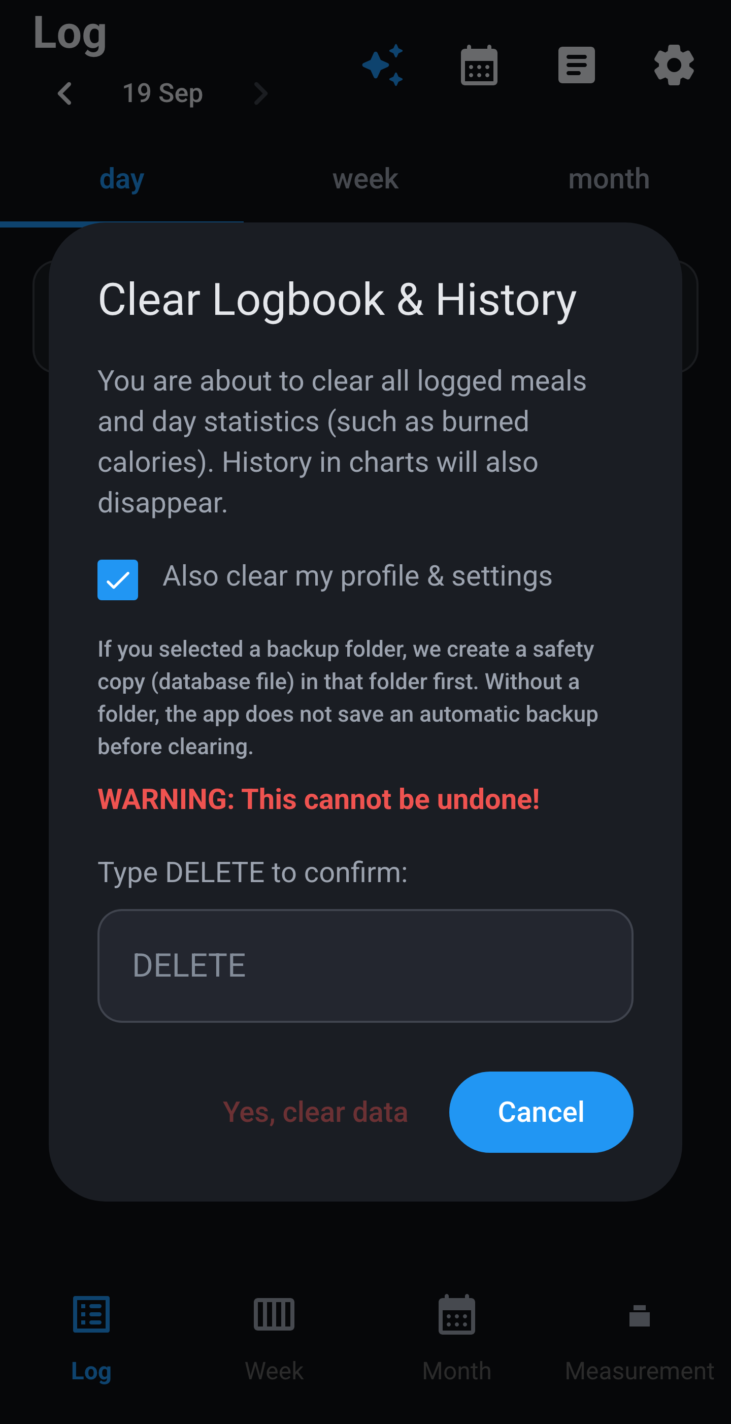
The last menu item, and the only one in the app that throws data away with no route back.

The last item, in red. A dialog appears where you first have to type DELETE; only then does Yes, clear data become clickable, while Cancel is the button that stands out. The checkbox above it also wipes your profile and settings. If you have set a folder for backups, the app first writes a safety copy into it. Without that folder it does not, and then it is gone.

More survives than you would expect. Your meals, day statistics, measurements and reports go, and your profile history always goes with them, even when you leave the checkbox off; that checkbox only covers your profile and settings themselves. But anything that came from Health stays: your workouts, your sleep and your daily values such as steps and heart rate are still there afterwards. Your conversations with the coach are kept too. On Android your week menus and earned milestones also remain, while on iPhone they are cleared, and only Android makes that safety copy beforehand.

Clear logbook · confirmation
⚖ Measurements

Measurements tab

Three sub-tabs in app order: Overview, Input, Trend. Below you get those three screens first, then every measurement on its own: where its tile sits, what the app works out from it and what the graph shows.

Overview

At the top the period bar: a week, a month, three or six months, a year, All or your own range. Overview and Trend use the same bar but remember their choice separately. Below it the expandable Health overview block → watch story. Then twelve tiles in app order: resting heart rate, sleep, workouts, weight, BMI, FFMI, body-fat, body measurements, strength, sport, blood pressure and cholesterol. A date line Latest measurement: … only appears on weight, body-fat, blood pressure and cholesterol. Body measurements, strength and sport show just their name, because each holds several types of your own. Arrows and differences are not here, they belong to Trend.

Overview · Measurements tab

Input

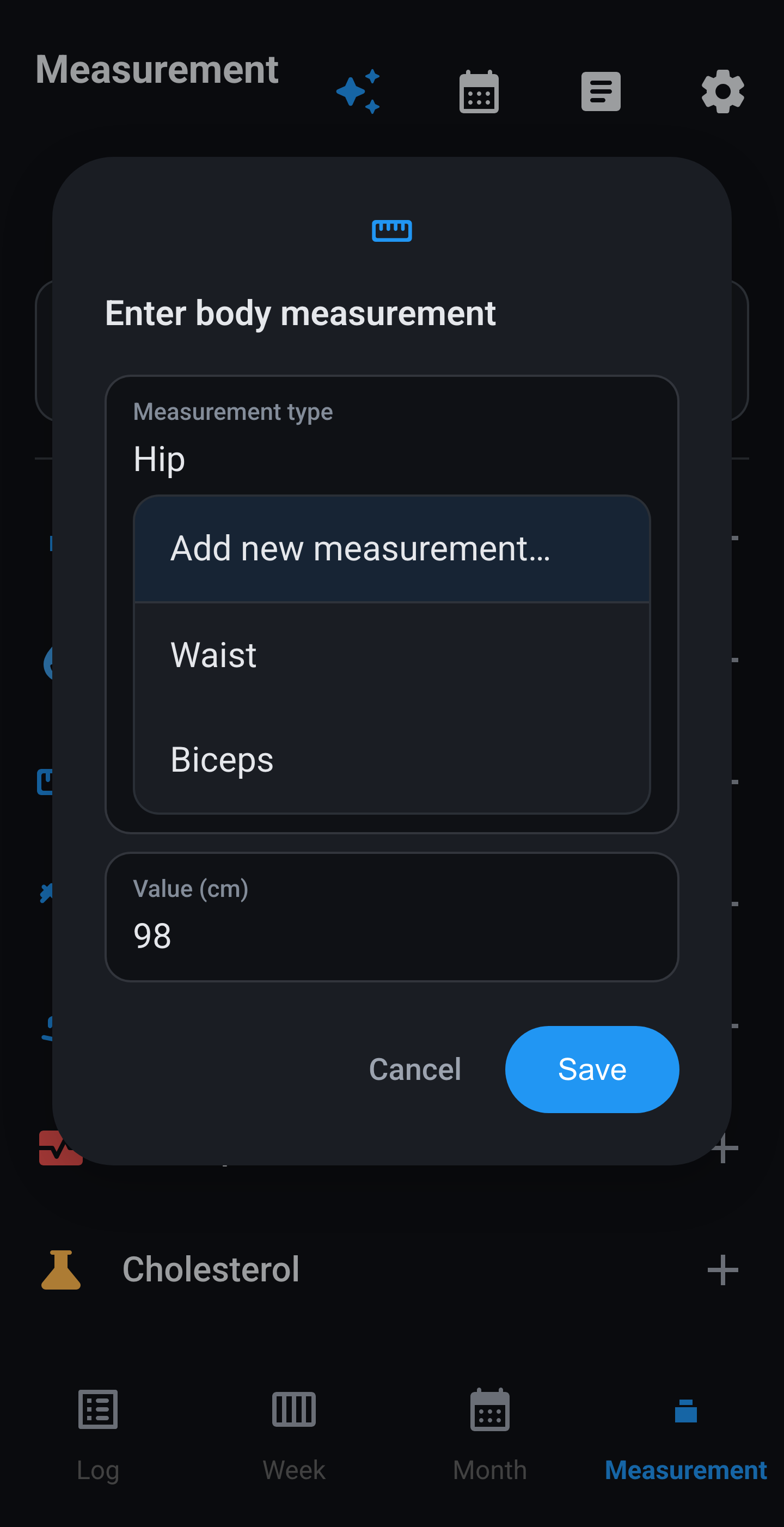
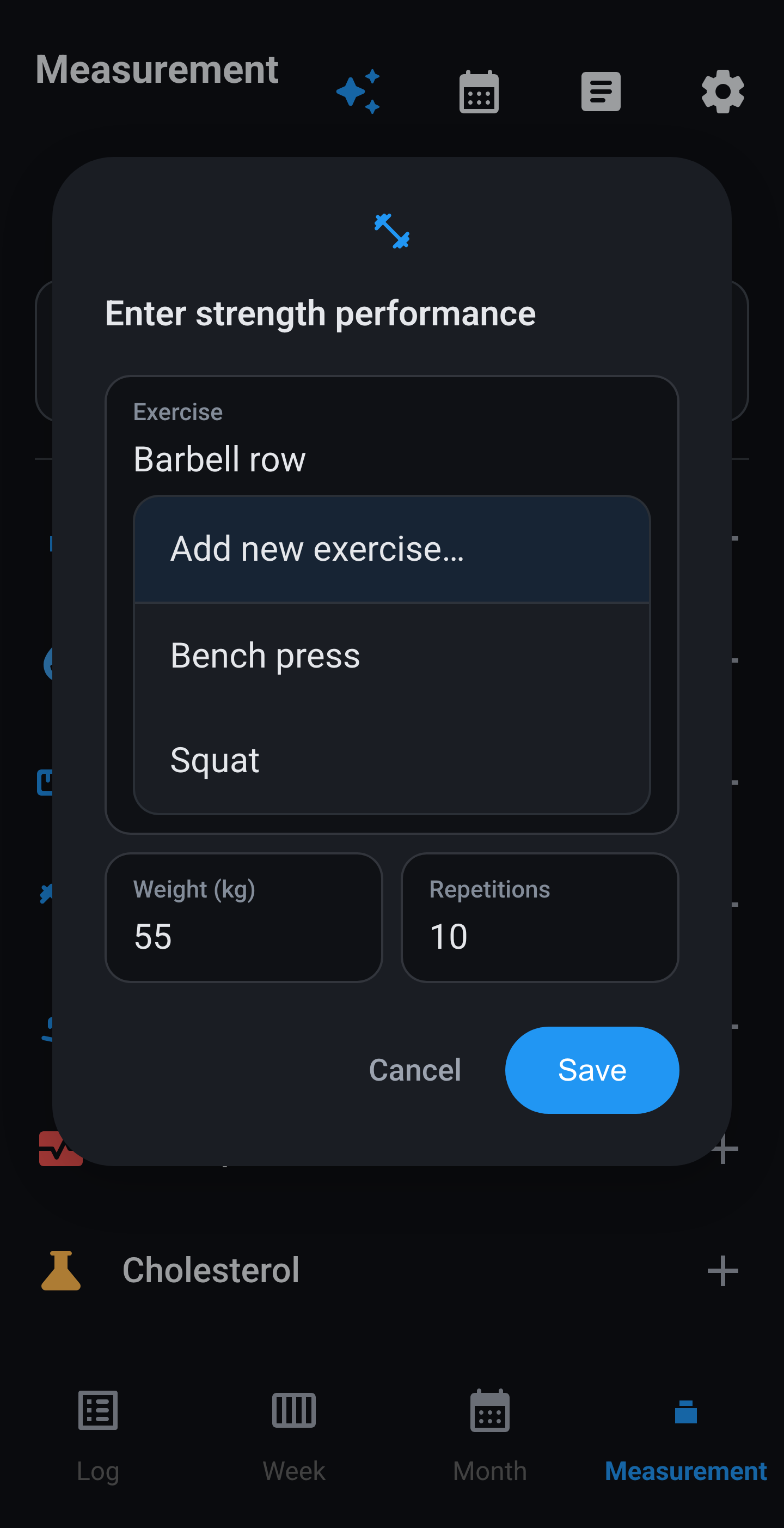
At the top you pick the date, so a missed day can still be filled in. Backwards is always allowed, forwards is not. Seven rows: weight, body-fat, body measurements, strength (weight and reps), sport (distance and time), blood pressure (systolic and diastolic) and cholesterol (total, HDL and triglycerides, after which LDL is calculated). After saving a window may appear: Measurement: goals updated when your newest weight or body-fat shifts your kcal and protein, a note that you have moved into another WHO category, a warning about a body-fat reading far from the previous one, or Target weight reached.
Body measurements, strength and sport have no fixed catalogue. Pick a previous name or tap Add new … and type Hip, Barbell row, Padel, Pickleball, yourself. Whatever you type is remembered and appears alphabetically in the list next time. Long press a row in the history to rename it or to delete everything of that type.

Input · seven actions
Body measurement · custom
Strength · custom exercise
Sport · Padel
📊 Per measurement

Every measurement on its own

Per measurement: where it sits, what the app does with it and what the charts show. Everything below is entered by you. What your watch supplies lives under Health linking.

Almost every measurement has two charts, and they sit behind two different tabs. Overview takes you to the normal chart: every data point exactly as you entered it, joined by a blue line with a blue haze underneath. Trend takes you to the trend chart: there the blue line is a moving average and your actual measurements sit around it as grey dots, with no haze. The normal chart shows what happened, the trend chart shows which way it is going. You never see both at once. Below, each measurement starts with the normal chart and then the trend.

Weight

The tile on Overview shows your newest weigh-in regardless of the period bar, with the line Latest measurement: …. Tap it for the weight screen: period bar, graph and below it your history with the newest on top. A row that came from Health carries a source badge. Tap a row to change or delete the value; that can make your daily goals recalculate. Under two measurements the app draws no line but says there are not enough points yet.

The normal chart opens from Overview and plots every weigh in as a separate point on the blue line, with the gradient underneath. The vertical axis scales to your own range rather than starting at zero, which makes a one kilo difference clearly visible. A line appears from two weigh ins onwards; below that the app tells you there are not enough points yet.

That same screen has the Expected weight chip, off by default. Turned on, the app converts your kcal balance into kilos at 7700 kcal per kilo and lays that over your weigh-ins as a second line, starting from your oldest weigh-in inside the chosen range. Only days you actually logged count, so with gaps in your logbook that line says little.

Weight · normal chart with individual weigh ins

The trend chart opens from Trend and replaces those separate points with an average over seven calendar days. Your weigh ins stay visible as grey dots, so you can see how far a given day sat from the line. Since water and salt can easily swing your weight by a kilo from one day to the next, this is the line to watch if you want to know whether you are really losing. The weekly difference sits above the chart.

Weight · trend chart with expected line
Weight · trend chart without expected line

BMI

BMI is your weight divided by your height squared. Without a height in Profile the tile stays empty with a note to fill it in first. On Overview the value appears with the line Category: … following six WHO bands: under 18.5 underweight, up to 25 normal, up to 30 overweight and above that three classes of obesity. Below the chart a spectrum card shows the full scale from 0 to 40 with your point on it, and BMI does not tell everything opens the explanation that muscle mass is not counted. Not medical advice → Health sources.

The normal chart works differently from all the others. The WHO thresholds are not drawn as horizontal lines; instead the line itself changes colour the moment you cross a threshold, and a vertical bar to the left of the chart shows which band belongs to which height. If your BMI drops from 25.4 to 24.8, the stretch of line in between switches from orange to green exactly at the threshold, not only at your next measurement.

BMI · normal chart, the line colours per WHO band

The trend chart averages over your last four measurements and so looks straight through the daily noise in your weight. Useful when you sit just below or just above a threshold and want to know whether that is chance or a direction.

BMI · trend chart, averaged over four measurements

FFMI

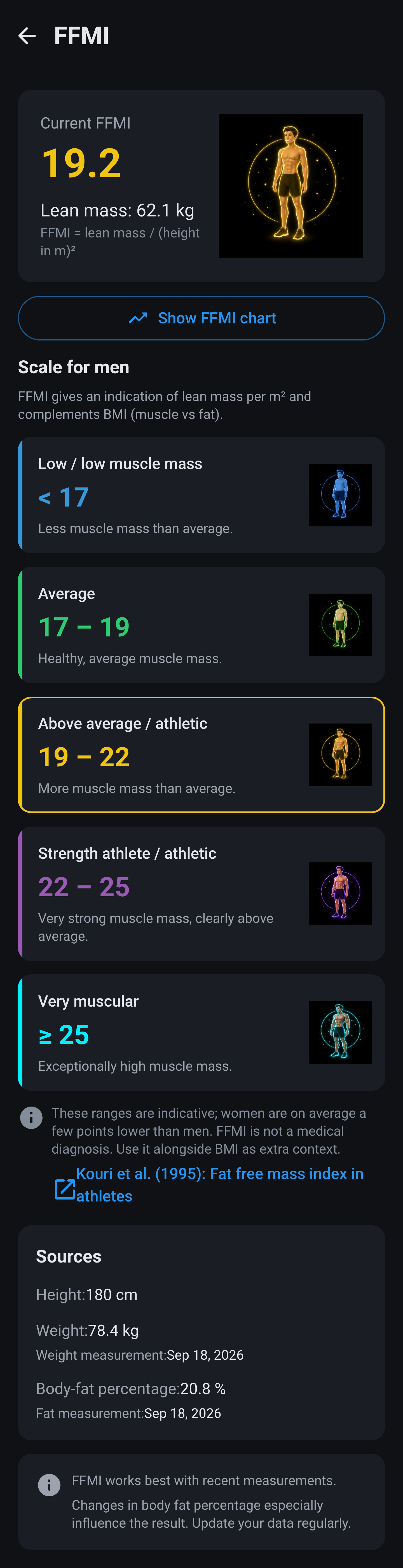
FFMI looks at your muscle mass instead of your total weight and complements BMI that way. The app first takes your body-fat percentage off your weight, and divides that lean mass by your height squared. So a body-fat reading is needed: without one the tile stays an invitation to add it, and with a reading older than ninety days it lapses with the window Body-fat outdated. Values below 5 or above 55 percent are not accepted.

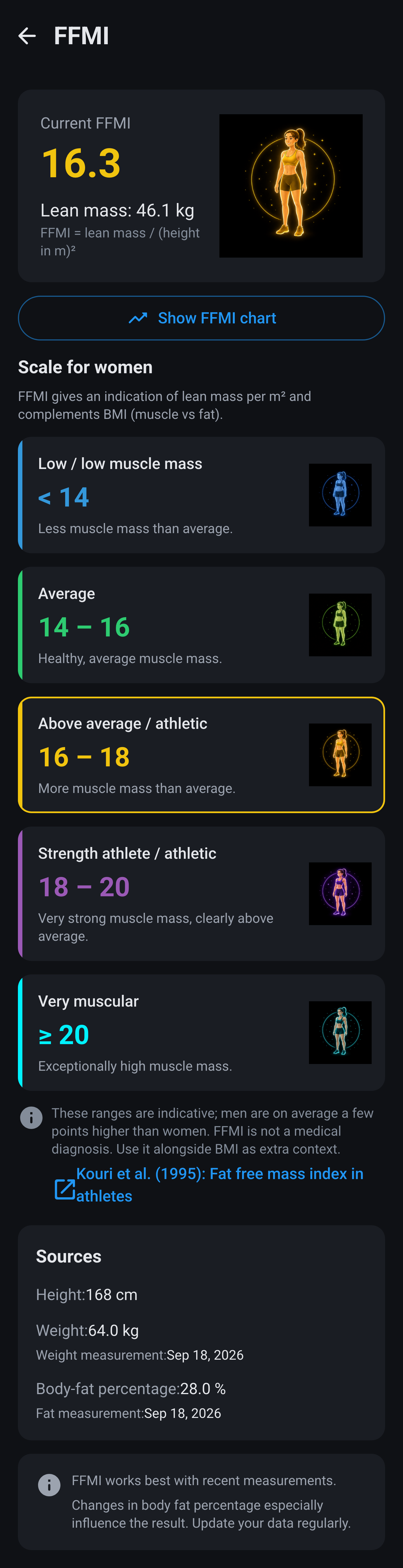
Tap the tile and at the top you get your own FFMI with your lean mass and the formula, next to the figure belonging to your tier. Below it the whole scale: five bands from low to very muscular, each with its own colour, range and drawing, and your band outlined. Tap a drawing to see it large. The boundaries follow the sex in your profile: for men 17, 19, 22 and 25, for women 14, 16, 18 and 20. The same FFMI therefore lands higher on the scale for a woman. If your profile has no sex, the app keeps to the men's scale.

FFMI · scale for men
FFMI · scale for women

At the bottom of that screen you see which weight, which height and which body fat percentage were used, with the date of both measurements, so you can trace where the number came from. The Show FFMI chart button opens the normal chart: your individual FFMI values, where the line changes colour as you cross a tier boundary just as it does for BMI, with the tier bar alongside.

FFMI · normal chart via the button, coloured per tier

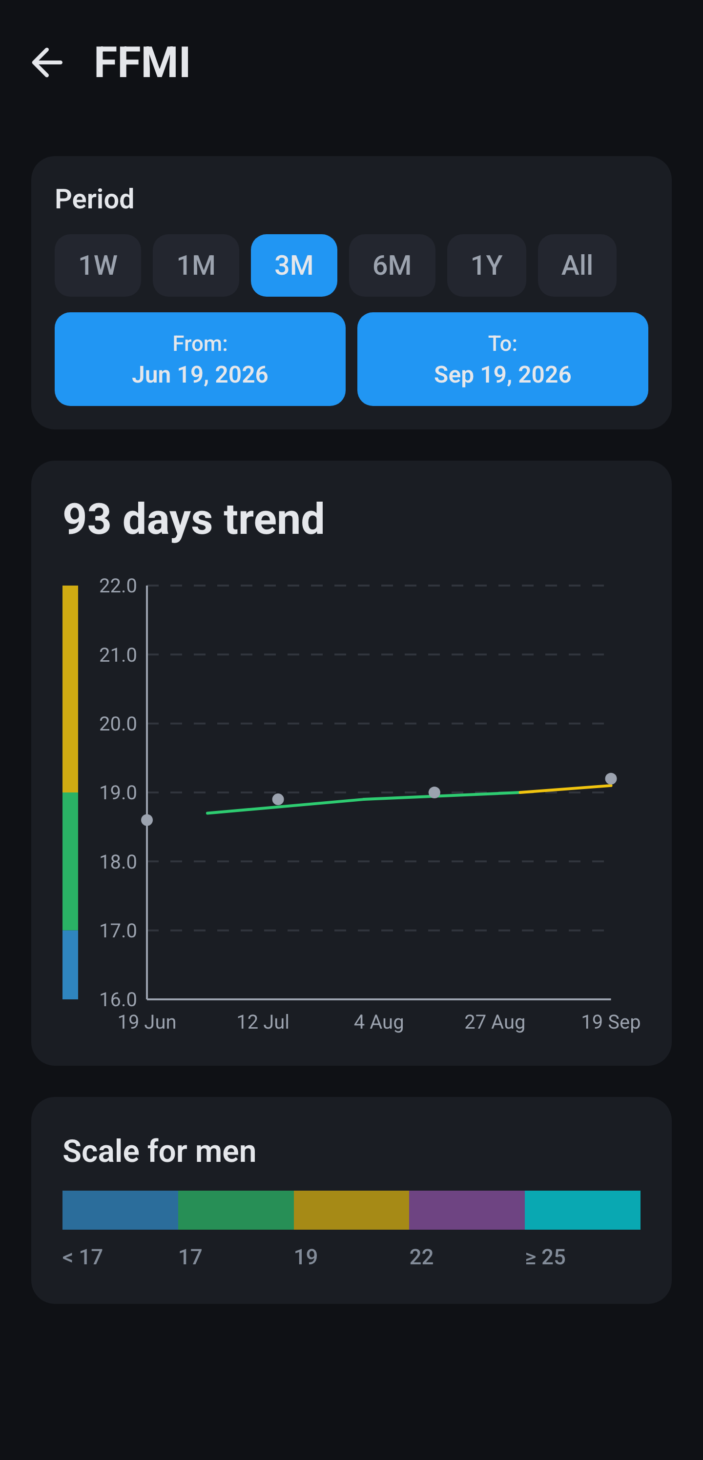
The Trend tab takes you to that same chart, but averaged over your last four measurements, with your actual values as grey dots alongside. Because FFMI depends on two measurements at once, your weight and your body fat, that averaged line is especially useful here: a single off body fat reading does not immediately pull it sideways.

FFMI · trend chart, averaged over four measurements

Body-fat

The tile shows your most recent measurement within the chosen period, with its date. Your body fat percentage also feeds your FFMI, and if your goals run on the body fat route a new measurement shifts your daily targets straight away. If a measurement jumps far from the previous one, the app warns you that you may have mistyped.

The normal chart puts every measurement as a point on the blue line with the gradient underneath, and the axis runs in percentages with one decimal. Because most scales estimate body fat from electrical resistance, and that varies day to day with how much you have drunk, those points often sit further apart than you would expect.

Body fat · normal chart with individual measurements

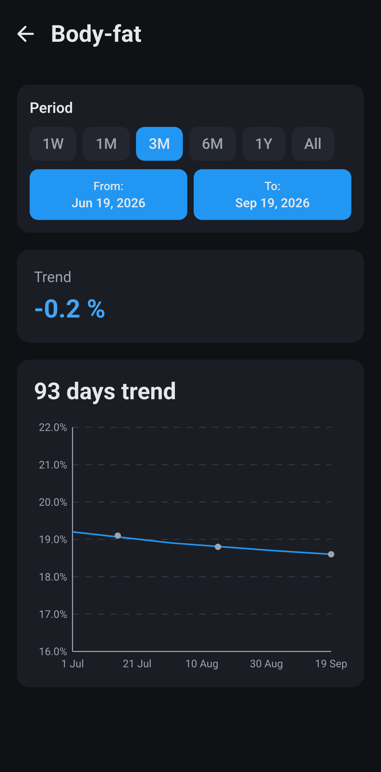
The trend chart averages over your last four measurements and looks back at most 180 days while doing so. The arrow above it is in percentage points, so 22.0 to 20.5 is 1.5 percentage points and not seven percent. This is the line to steer by, because individual body fat measurements say very little.

Body fat · trend chart, averaged over four measurements

Body measurements

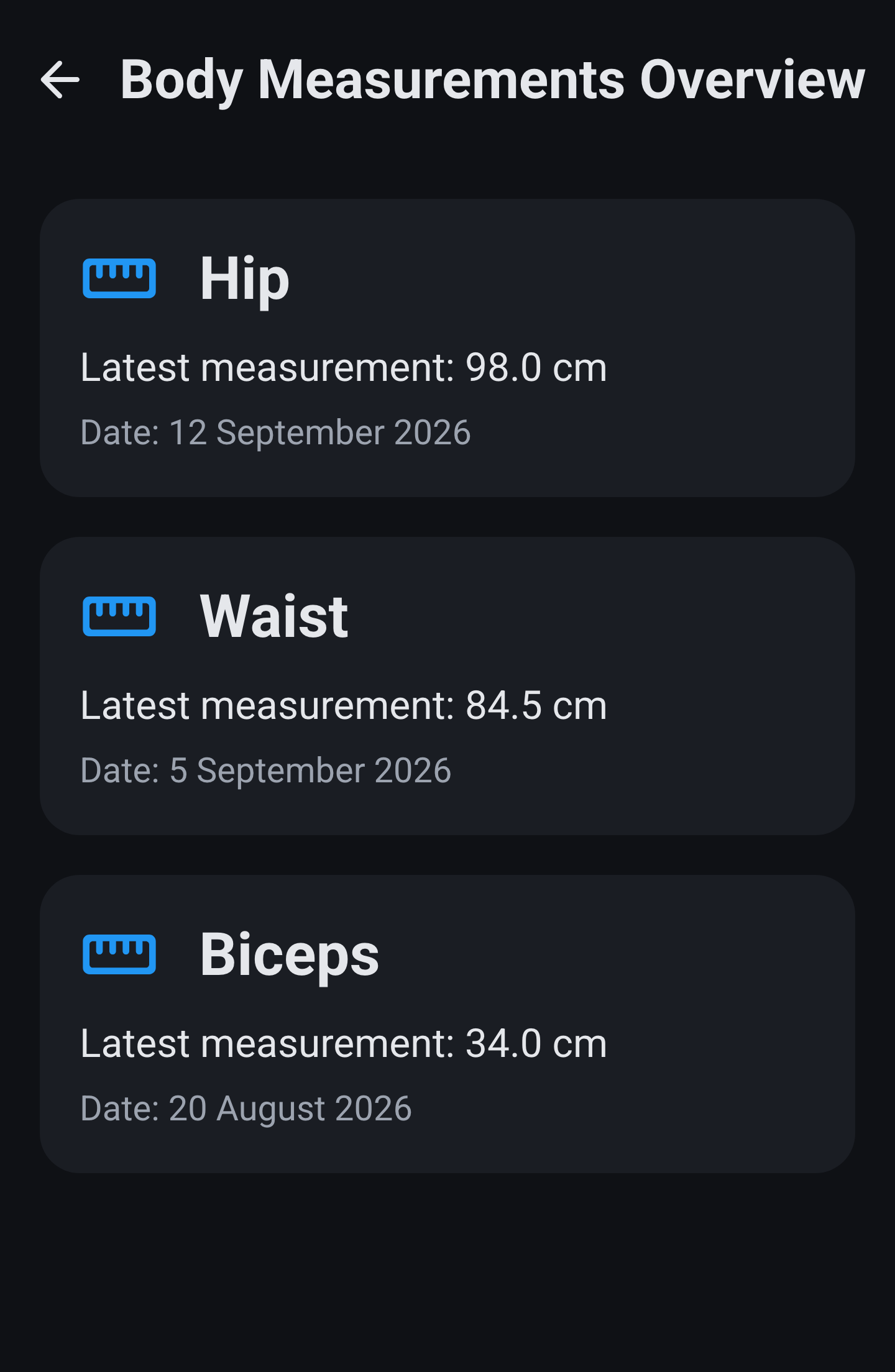
The tile shows only its name and opens a list of the measurements you use, each with its latest value and date. Press and hold such a row to rename that measurement or wipe everything of it. Tap it for the graph and the history of that one measurement. The moving average runs over four readings looking back at most a year, and the arrow is in centimetres.

Every measurement type has its own chart, and this is the normal one: your measurements in centimetres as points on the blue line with the gradient underneath. The Trend tab gives you the same measurement averaged over your last four readings. Your waist is the most useful one to follow here, because it keeps changing while your weight stays level once you trade fat for muscle.

Body measurements · history
Waist · normal chart

Strength performance

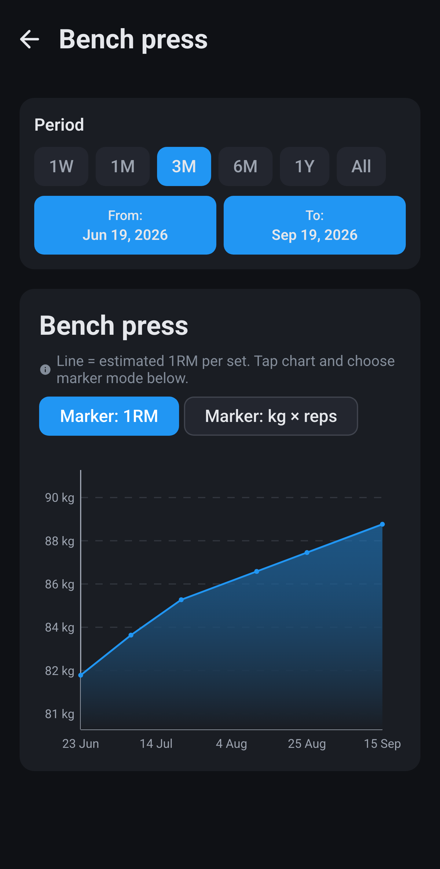
Per exercise you record your weight and reps. The graph does not show that weight but your estimated 1RM by Epley: weight times one plus reps divided by thirty. Per calendar day your best attempt counts, so a warm-up set does not drag the line down. The moving average runs over five readings looking back at most 180 days, and the arrow is in kilos.

The chart does not show the weight you lifted but your estimated 1RM, meaning what you could manage once if you went all out. That makes three sets of ten and a single set of three comparable after all. This is the normal chart, with your individual sets as points on the blue line and the gradient underneath; the chip above it switches between 1RM and the raw kilos times reps. The Trend tab gives you that same exercise averaged over your last five measurements.

Strength · history
Bench press · normal chart with 1RM

Sport performance

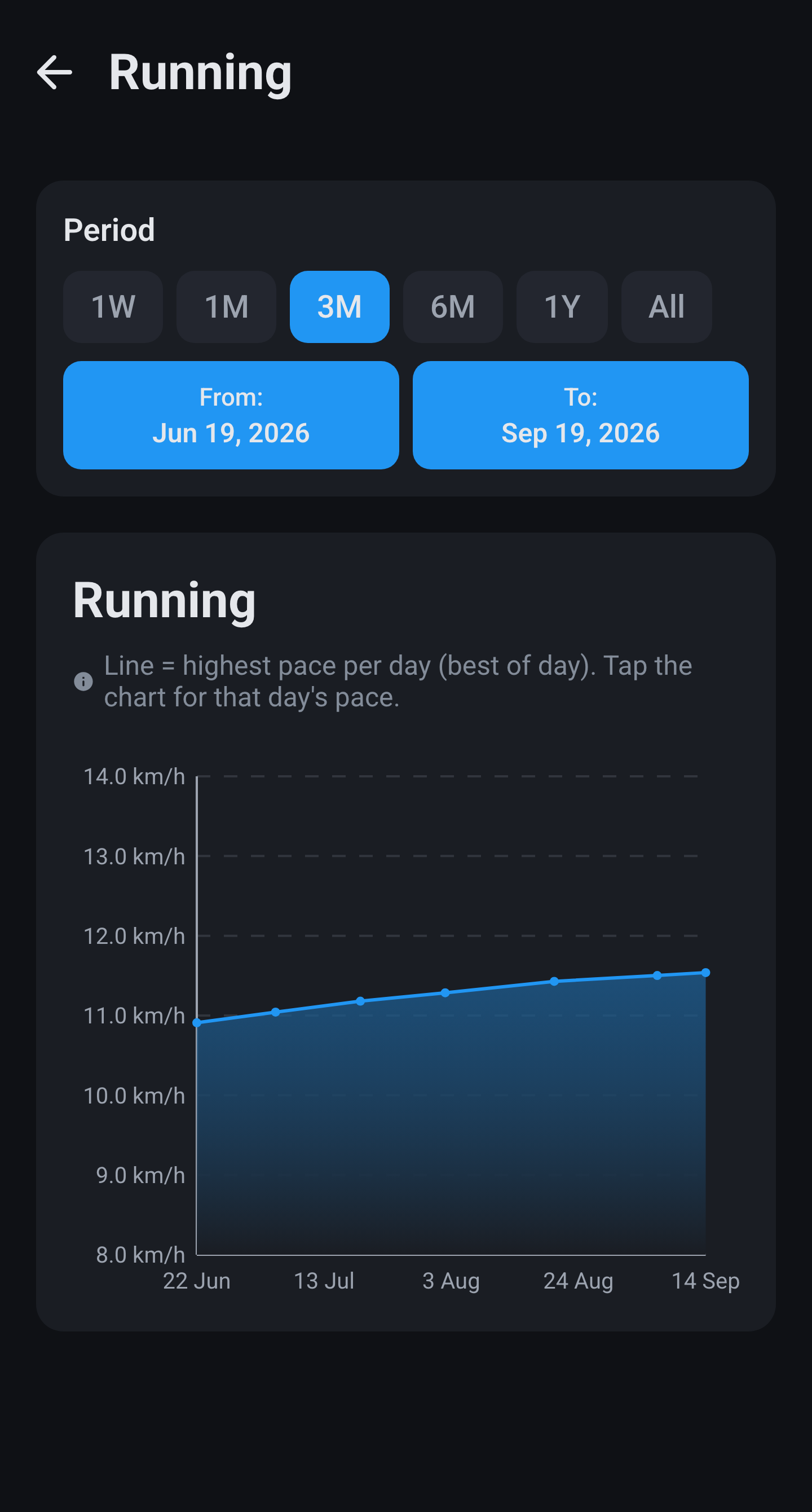
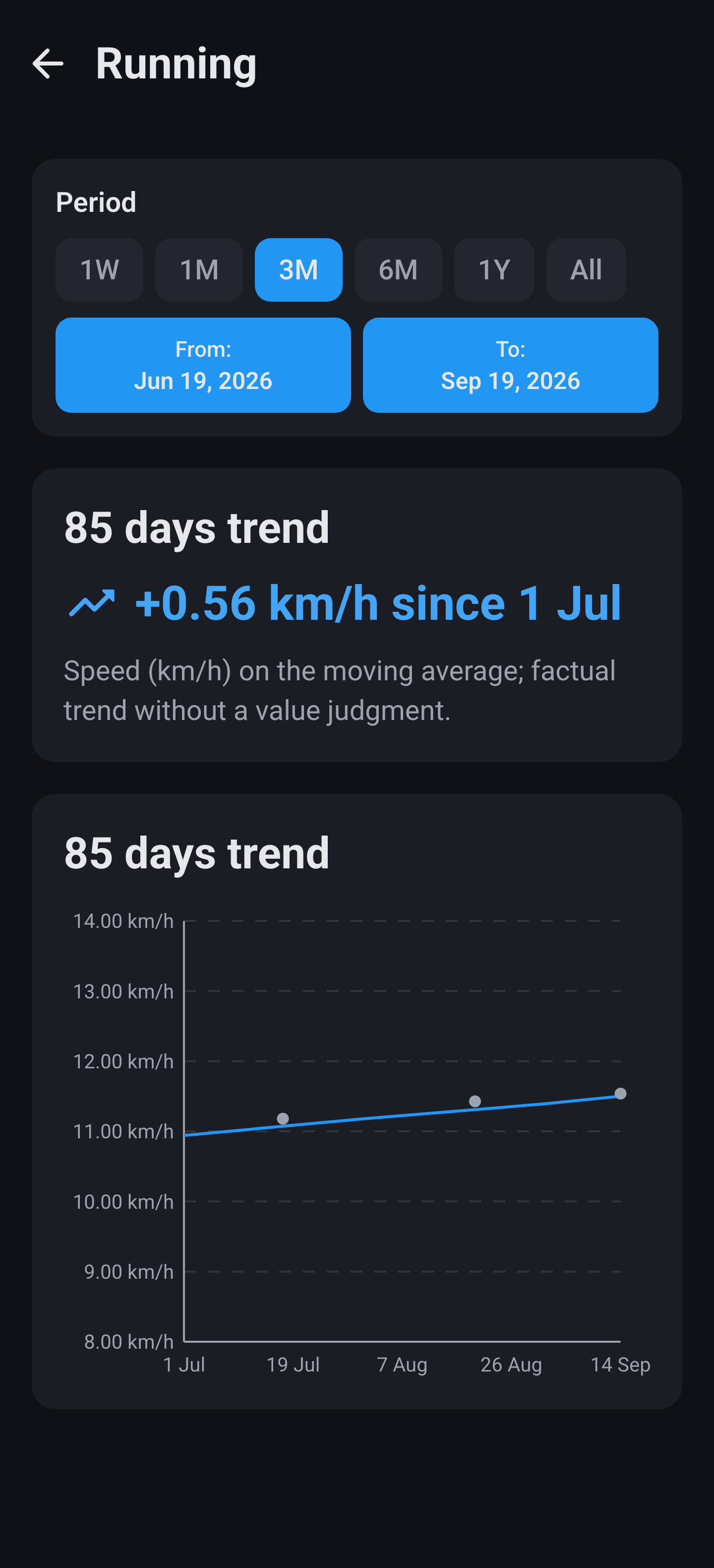
Per sport you record distance and time. From that the app works out your pace in kilometres per hour, and per day your highest pace counts. You get two graphs: the daily best from the list, and on Trend the smoothed line over five readings with the arrow in kilometres per hour. Log a sport without distance, such as padel, and the pace comes out at zero. The time does stay in your history.

The normal chart shows your best effort in that sport per day, converted to kilometres per hour so that faster also sits higher on the axis. Your individual days appear as points on the blue line with the gradient underneath.

Sport · history
Running · normal chart with daily best

The trend chart averages over your last five measurements and is meant to let you see past a bad day. Above the chart it says how far you have moved since the first point, also in kilometres per hour.

Running · trend chart, averaged over five measurements

Blood pressure and cholesterol

Blood pressure is logged as systolic and diastolic; the tile shows both in mmHg and the graph draws two lines from it. The app puts no judgement on it, there are no categories. For cholesterol you enter total, HDL and triglycerides, after which the app calculates LDL as total minus HDL minus triglycerides divided by 2.2, and warns that the outcome becomes unreliable above 4.5 mmol/L of triglycerides. The tile shows the total with the line Ratio: …, which is total divided by HDL. The graph screen has two tabs: LDL/HDL balance and triglycerides/ratio.

This last group has only a normal chart and no trend version: blood pressure, cholesterol, resting heart rate and sleep have no tile on the Trend tab, so no moving average is calculated for them either. Workouts have no chart at all and stay a list.

❖ More

Anything else?

Not finding your question? The FAQ covers the odd cases, and the setup guide walks you through the first install. Which watches and apps deliver data is on the homepage under Health.